005-001. matplotlib, magic command, plot(), plot(kind="bar"), hist(), scatter()
# @
# Most used plots are line plot, bar plot, histogram, scatter diagram
# @
# Magic commands of matplotlib
# %matplotlib <comand>
# %matplotlib nbagg: You can manipulate plots interactively
# %matplotlib inline: You can show plot in cell but can't manipulate plots interactively
# @
%matplotlib nbagg
import matplotlib
# pyplot is subpackage of matplotlib
import matplotlib.pyplot as plt
import pandas as pd
import numpy as np
series=pd.Series(np.random.rand(10).cumsum(),index=np.arange(0,100,10))
# 0 0.404094
# 10 1.206938
# 20 1.765261
# 30 2.335933
# 40 3.246339
# 50 4.098992
# 60 4.187145
# 70 5.065970
# 80 5.382409
# 90 5.727608
# You can draw line plot on series
series.plot()
# img 8962dc24-8ebd-4ca8-aec7-e32f79d2182e
 # You can get same result with above code by following code
plt.plot(series)
# @
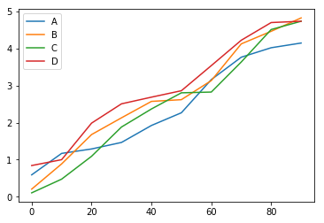
dataframe=pd.DataFrame(np.random.rand(10,4).cumsum(axis=0)\
,columns=["A","B","C","D"]\
,index=np.arange(0,100,10))
# A B C D
# 0 0.592465 0.207700 0.107388 0.842806
# 10 1.169806 0.886713 0.476341 1.000724
# 20 1.289329 1.677117 1.092054 1.985201
# 30 1.465031 2.128451 1.880766 2.505312
# 40 1.922107 2.570523 2.366606 2.684610
# 50 2.264113 2.616970 2.801705 2.857887
# 60 3.157483 3.131391 2.821849 3.534764
# 70 3.760922 4.119760 3.631236 4.217623
# 80 4.016019 4.458751 4.506558 4.694503
# 90 4.142605 4.819199 4.729676 4.728988
dataframe.plot()
# plt.plot(dataframe)
# img d39b8e7c-140b-4ac9-8d78-ba195da3bc2e
# You can get same result with above code by following code
plt.plot(series)
# @
dataframe=pd.DataFrame(np.random.rand(10,4).cumsum(axis=0)\
,columns=["A","B","C","D"]\
,index=np.arange(0,100,10))
# A B C D
# 0 0.592465 0.207700 0.107388 0.842806
# 10 1.169806 0.886713 0.476341 1.000724
# 20 1.289329 1.677117 1.092054 1.985201
# 30 1.465031 2.128451 1.880766 2.505312
# 40 1.922107 2.570523 2.366606 2.684610
# 50 2.264113 2.616970 2.801705 2.857887
# 60 3.157483 3.131391 2.821849 3.534764
# 70 3.760922 4.119760 3.631236 4.217623
# 80 4.016019 4.458751 4.506558 4.694503
# 90 4.142605 4.819199 4.729676 4.728988
dataframe.plot()
# plt.plot(dataframe)
# img d39b8e7c-140b-4ac9-8d78-ba195da3bc2e
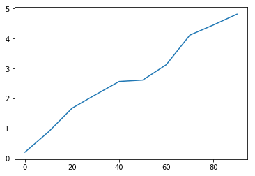
 # When you want to draw only one column data,
# for example, "B" column data,
# you should first extract column as Series,
# then invoke plot()
dataframe["B"].plot()
# img 9fbb28e8-708d-4f22-96e4-baad9058f0ff
# When you want to draw only one column data,
# for example, "B" column data,
# you should first extract column as Series,
# then invoke plot()
dataframe["B"].plot()
# img 9fbb28e8-708d-4f22-96e4-baad9058f0ff
 # @
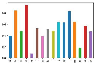
# Let's talk about bar plot
# This is useful when X data has discret value
series_2=pd.Series(np.random.rand(16),index=list("abcdefghijklmnop"))
# a 0.397676
# b 0.846862
# c 0.480277
# d 0.941101
# e 0.078108
# f 0.528784
# g 0.389172
# h 0.515487
# i 0.484657
# j 0.638249
# k 0.630691
# l 0.832333
# m 0.640034
# n 0.183421
# o 0.573656
# p 0.474688
series_2.plot(kind="bar")
# img 3bfb0c29-ec34-4033-a6cd-cff24cc4936b
# @
# Let's talk about bar plot
# This is useful when X data has discret value
series_2=pd.Series(np.random.rand(16),index=list("abcdefghijklmnop"))
# a 0.397676
# b 0.846862
# c 0.480277
# d 0.941101
# e 0.078108
# f 0.528784
# g 0.389172
# h 0.515487
# i 0.484657
# j 0.638249
# k 0.630691
# l 0.832333
# m 0.640034
# n 0.183421
# o 0.573656
# p 0.474688
series_2.plot(kind="bar")
# img 3bfb0c29-ec34-4033-a6cd-cff24cc4936b
 series_2.plot(kind="barh")
# @
dataframe_2=pd.DataFrame(np.random.rand(6,4),
index=["one","two","three","four","five","six"],
columns=pd.Index(["A","B","C","D"],name="Genus"))
# Genus A B C D
# one 0.066980 0.804447 0.131766 0.789896
# two 0.400801 0.799834 0.177774 0.688652
# three 0.777141 0.294200 0.759455 0.372023
# four 0.824237 0.166228 0.438885 0.113845
# five 0.986942 0.396242 0.156756 0.779464
# six 0.210179 0.495291 0.521406 0.581041
dataframe_2.plot(kind="bar")
dataframe_2.plot(kind="barh",stacked=True)
# @
# Let's talk about histogram
# Histogram doesn't require index
series_3=pd.Series(np.random.normal(0,1,size=200))
series_3.hist()
# bin=50 means one segment contains 50
series_3.hist(bins=50)
series_3.hist(bins=100,normed=True)
# @
# Scatter diagram
# bar, histogram: x -> y
# scatter diagram: 2 independant variable x, y
# its relation
x1=np.random.normal(1,1,size=(100,1))
x2=np.random.normal(-2,4,size=(100,1))
x=np.concatenate((x1,x2),axis=1)
dataframe_3=pd.DataFrame(x,columns=["x1","x2"])
plt.scatter(dataframe_3["x1"],dataframe_3["x2"])
# width: x1
# height: x2
# If x1, x2 have positive relation,
# scatter diagram will be plotted,
# along with right increasing diagonal line
# It turned out we can't see relation between x1 and x2
series_2.plot(kind="barh")
# @
dataframe_2=pd.DataFrame(np.random.rand(6,4),
index=["one","two","three","four","five","six"],
columns=pd.Index(["A","B","C","D"],name="Genus"))
# Genus A B C D
# one 0.066980 0.804447 0.131766 0.789896
# two 0.400801 0.799834 0.177774 0.688652
# three 0.777141 0.294200 0.759455 0.372023
# four 0.824237 0.166228 0.438885 0.113845
# five 0.986942 0.396242 0.156756 0.779464
# six 0.210179 0.495291 0.521406 0.581041
dataframe_2.plot(kind="bar")
dataframe_2.plot(kind="barh",stacked=True)
# @
# Let's talk about histogram
# Histogram doesn't require index
series_3=pd.Series(np.random.normal(0,1,size=200))
series_3.hist()
# bin=50 means one segment contains 50
series_3.hist(bins=50)
series_3.hist(bins=100,normed=True)
# @
# Scatter diagram
# bar, histogram: x -> y
# scatter diagram: 2 independant variable x, y
# its relation
x1=np.random.normal(1,1,size=(100,1))
x2=np.random.normal(-2,4,size=(100,1))
x=np.concatenate((x1,x2),axis=1)
dataframe_3=pd.DataFrame(x,columns=["x1","x2"])
plt.scatter(dataframe_3["x1"],dataframe_3["x2"])
# width: x1
# height: x2
# If x1, x2 have positive relation,
# scatter diagram will be plotted,
# along with right increasing diagonal line
# It turned out we can't see relation between x1 and x2