# googleColaboratory-XRBXMohjQos
# @
# There is way you use gpu freely
# Search colaboratory in google drive and add it
# Colaboratory is kind of jupyter notebook which is moved to google drive cloud
# You can use gpu in colaboratory
# To use gpu, go to change runtime type, select hardware accelerator
# You can install new library like !pip install -q matplotlib-venn
# @
# google colaboratory charts
# @
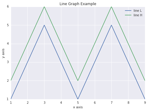
# Matplotlib is the most common charting package
import matplotlib.pyplot as plt
x = [1, 2, 3, 4, 5, 6, 7, 8, 9]
y1 = [1, 3, 5, 3, 1, 3, 5, 3, 1]
y2 = [2, 4, 6, 4, 2, 4, 6, 4, 2]
plt.plot(x, y1, label="line L")
plt.plot(x, y2, label="line H")
plt.plot()
# Legend
plt.xlabel("x axis")
plt.ylabel("y axis")
plt.title("Line Graph Example")
plt.legend()
plt.show()
# img e33de939-f9bc-4475-8672-cbded8f8b57c
 # @
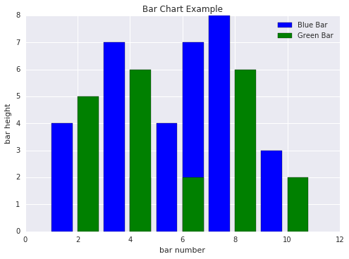
# Bar Plots
import matplotlib.pyplot as plt
# Look at index 4 and 6, which demonstrate overlapping cases.
x1 = [1, 3, 4, 5, 6, 7, 9]
y1 = [4, 7, 2, 4, 7, 8, 3]
x2 = [2, 4, 6, 8, 10]
y2 = [5, 6, 2, 6, 2]
# Colors: https://matplotlib.org/api/colors_api.html
plt.bar(x1, y1, label="Blue Bar", color='b')
plt.bar(x2, y2, label="Green Bar", color='g')
plt.plot()
plt.xlabel("bar number")
plt.ylabel("bar height")
plt.title("Bar Chart Example")
plt.legend()
plt.show()
# img 05173cf2-b9e8-4752-8e5a-d1bcdf5d8454
# @
# Bar Plots
import matplotlib.pyplot as plt
# Look at index 4 and 6, which demonstrate overlapping cases.
x1 = [1, 3, 4, 5, 6, 7, 9]
y1 = [4, 7, 2, 4, 7, 8, 3]
x2 = [2, 4, 6, 8, 10]
y2 = [5, 6, 2, 6, 2]
# Colors: https://matplotlib.org/api/colors_api.html
plt.bar(x1, y1, label="Blue Bar", color='b')
plt.bar(x2, y2, label="Green Bar", color='g')
plt.plot()
plt.xlabel("bar number")
plt.ylabel("bar height")
plt.title("Bar Chart Example")
plt.legend()
plt.show()
# img 05173cf2-b9e8-4752-8e5a-d1bcdf5d8454
 # @
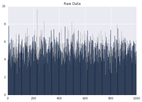
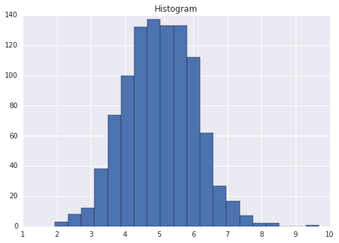
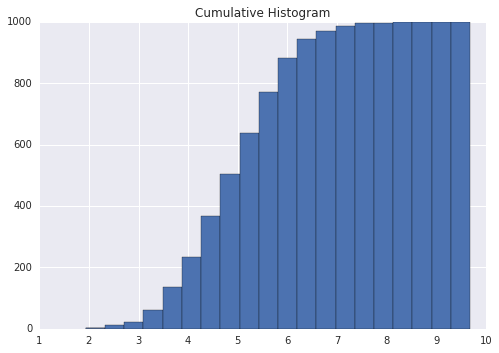
# Histograms
import matplotlib.pyplot as plt
import numpy as np
# Use numpy to generate a bunch of random data in a bell curve around 5.
n = 5 + np.random.randn(1000)
m = [m for m in range(len(n))]
# Bar chart
plt.bar(m, n)
plt.title("Raw Data")
plt.show()
# Histogram
plt.hist(n, bins=20)
plt.title("Histogram")
plt.show()
# Low bins mean wide width of bar
plt.hist(n, cumulative=True, bins=20)
plt.title("Cumulative Histogram")
plt.show()
# img afcab3f5-bd56-4626-8726-431352aeb4bb
# @
# Histograms
import matplotlib.pyplot as plt
import numpy as np
# Use numpy to generate a bunch of random data in a bell curve around 5.
n = 5 + np.random.randn(1000)
m = [m for m in range(len(n))]
# Bar chart
plt.bar(m, n)
plt.title("Raw Data")
plt.show()
# Histogram
plt.hist(n, bins=20)
plt.title("Histogram")
plt.show()
# Low bins mean wide width of bar
plt.hist(n, cumulative=True, bins=20)
plt.title("Cumulative Histogram")
plt.show()
# img afcab3f5-bd56-4626-8726-431352aeb4bb
 # img 5e315652-ed08-4eb5-8d7a-cd30342d7786
 # img f0d46bf9-f843-4a9e-87e6-2eb936aab71b
 # @
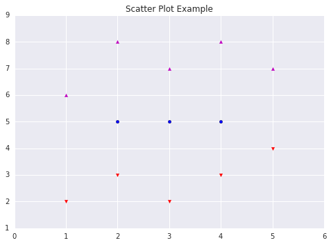
# Scatter Plots which represent variance
import matplotlib.pyplot as plt
x1 = [2, 3, 4]
y1 = [5, 5, 5]
x2 = [1, 2, 3, 4, 5]
y2 = [2, 3, 2, 3, 4]
y3 = [6, 8, 7, 8, 7]
# Markers: https://matplotlib.org/api/markers_api.html
plt.scatter(x1, y1)
plt.scatter(x2, y2, marker='v', color='r')
plt.scatter(x2, y3, marker='^', color='m')
plt.title('Scatter Plot Example')
plt.show()
# img 10798f5f-e88e-4ab8-8ba3-81fb12abb932
# @
# Scatter Plots which represent variance
import matplotlib.pyplot as plt
x1 = [2, 3, 4]
y1 = [5, 5, 5]
x2 = [1, 2, 3, 4, 5]
y2 = [2, 3, 2, 3, 4]
y3 = [6, 8, 7, 8, 7]
# Markers: https://matplotlib.org/api/markers_api.html
plt.scatter(x1, y1)
plt.scatter(x2, y2, marker='v', color='r')
plt.scatter(x2, y3, marker='^', color='m')
plt.title('Scatter Plot Example')
plt.show()
# img 10798f5f-e88e-4ab8-8ba3-81fb12abb932
 # @
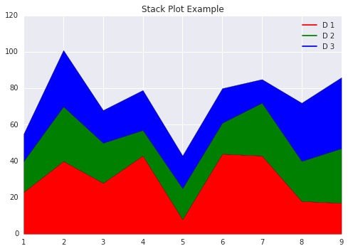
# Stack Plots
import matplotlib.pyplot as plt
idxes = [ 1, 2, 3, 4, 5, 6, 7, 8, 9]
arr1 = [23, 40, 28, 43, 8, 44, 43, 18, 17]
arr2 = [17, 30, 22, 14, 17, 17, 29, 22, 30]
arr3 = [15, 31, 18, 22, 18, 19, 13, 32, 39]
# Adding legend for stack plots is tricky.
plt.plot([], [], color='r', label = 'D 1')
plt.plot([], [], color='g', label = 'D 2')
plt.plot([], [], color='b', label = 'D 3')
plt.stackplot(idxes, arr1, arr2, arr3, colors= ['r', 'g', 'b'])
plt.title('Stack Plot Example')
plt.legend()
plt.show()
# img 5fa381ce-6d94-4994-a21b-70ea0ea89bc9
# @
# Stack Plots
import matplotlib.pyplot as plt
idxes = [ 1, 2, 3, 4, 5, 6, 7, 8, 9]
arr1 = [23, 40, 28, 43, 8, 44, 43, 18, 17]
arr2 = [17, 30, 22, 14, 17, 17, 29, 22, 30]
arr3 = [15, 31, 18, 22, 18, 19, 13, 32, 39]
# Adding legend for stack plots is tricky.
plt.plot([], [], color='r', label = 'D 1')
plt.plot([], [], color='g', label = 'D 2')
plt.plot([], [], color='b', label = 'D 3')
plt.stackplot(idxes, arr1, arr2, arr3, colors= ['r', 'g', 'b'])
plt.title('Stack Plot Example')
plt.legend()
plt.show()
# img 5fa381ce-6d94-4994-a21b-70ea0ea89bc9
 # @
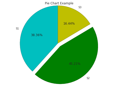
# Pie Charts
import matplotlib.pyplot as plt
labels = 'S1', 'S2', 'S3'
sections = [56, 66, 24]
colors = ['c', 'g', 'y']
plt.pie(sections, labels=labels, colors=colors,
startangle=90,
explode = (0, 0.1, 0),
autopct = '%1.2f%%')
plt.axis('equal') # Try commenting this out.
plt.title('Pie Chart Example')
plt.show()
# img ecf56cbb-356a-48f2-bb68-21a06dc88df7
# @
# Pie Charts
import matplotlib.pyplot as plt
labels = 'S1', 'S2', 'S3'
sections = [56, 66, 24]
colors = ['c', 'g', 'y']
plt.pie(sections, labels=labels, colors=colors,
startangle=90,
explode = (0, 0.1, 0),
autopct = '%1.2f%%')
plt.axis('equal') # Try commenting this out.
plt.title('Pie Chart Example')
plt.show()
# img ecf56cbb-356a-48f2-bb68-21a06dc88df7
 # @
# fill_between and alpha
import matplotlib.pyplot as plt
import numpy as np
ys = 200 + np.random.randn(100)
x = [x for x in range(len(ys))]
plt.plot(x, ys, '-')
# alpha = 1 means opaque graph
plt.fill_between(x, ys, 195, where=(ys > 195), facecolor='g', alpha=0.6)
plt.title("Fills and Alpha Example")
plt.show()
# img 88e888b0-be3d-442e-8eff-ffbafe37b84e
# @
# fill_between and alpha
import matplotlib.pyplot as plt
import numpy as np
ys = 200 + np.random.randn(100)
x = [x for x in range(len(ys))]
plt.plot(x, ys, '-')
# alpha = 1 means opaque graph
plt.fill_between(x, ys, 195, where=(ys > 195), facecolor='g', alpha=0.6)
plt.title("Fills and Alpha Example")
plt.show()
# img 88e888b0-be3d-442e-8eff-ffbafe37b84e
 # @
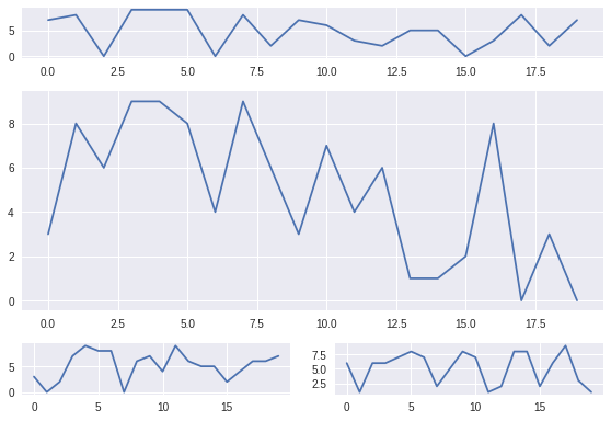
# Subplotting using Subplot2grid (one image with multiple graphs)
import matplotlib.pyplot as plt
import numpy as np
def random_plots():
xs = []
ys = []
for i in range(20):
x = i
y = np.random.randint(10)
xs.append(x)
ys.append(y)
return xs, ys
fig = plt.figure()
ax1 = plt.subplot2grid((5, 2), (0, 0), rowspan=1, colspan=2)
ax2 = plt.subplot2grid((5, 2), (1, 0), rowspan=3, colspan=2)
ax3 = plt.subplot2grid((5, 2), (4, 0), rowspan=1, colspan=1)
ax4 = plt.subplot2grid((5, 2), (4, 1), rowspan=1, colspan=1)
x, y = random_plots()
ax1.plot(x, y)
x, y = random_plots()
ax2.plot(x, y)
x, y = random_plots()
ax3.plot(x, y)
x, y = random_plots()
ax4.plot(x, y)
plt.tight_layout()
plt.show()
# img ab73e2da-2b97-4b1f-8f4d-6e864723b2ba
# @
# Subplotting using Subplot2grid (one image with multiple graphs)
import matplotlib.pyplot as plt
import numpy as np
def random_plots():
xs = []
ys = []
for i in range(20):
x = i
y = np.random.randint(10)
xs.append(x)
ys.append(y)
return xs, ys
fig = plt.figure()
ax1 = plt.subplot2grid((5, 2), (0, 0), rowspan=1, colspan=2)
ax2 = plt.subplot2grid((5, 2), (1, 0), rowspan=3, colspan=2)
ax3 = plt.subplot2grid((5, 2), (4, 0), rowspan=1, colspan=1)
ax4 = plt.subplot2grid((5, 2), (4, 1), rowspan=1, colspan=1)
x, y = random_plots()
ax1.plot(x, y)
x, y = random_plots()
ax2.plot(x, y)
x, y = random_plots()
ax3.plot(x, y)
x, y = random_plots()
ax4.plot(x, y)
plt.tight_layout()
plt.show()
# img ab73e2da-2b97-4b1f-8f4d-6e864723b2ba
 # @
# Plot styles
# Colaboratory charts use Seaborn's custom styling by default.
# @
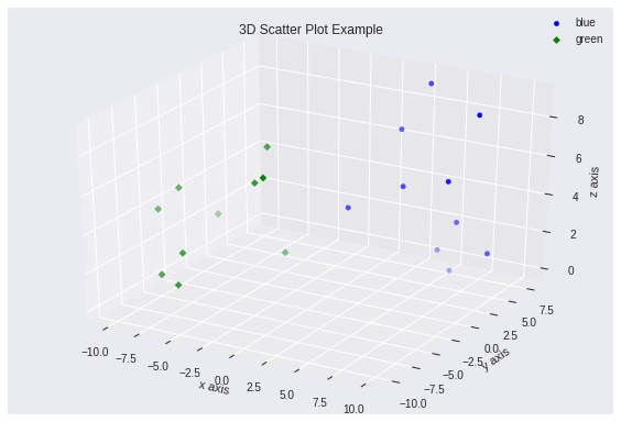
# 3D Scatter Plots
import matplotlib.pyplot as plt
import numpy as np
from mpl_toolkits.mplot3d import axes3d
fig = plt.figure()
# subplot is 3d
ax = fig.add_subplot(111, projection = '3d')
x1 = [1, 2, 3, 4, 5, 6, 7, 8, 9, 10]
y1 = np.random.randint(10, size=10)
z1 = np.random.randint(10, size=10)
x2 = [-1, -2, -3, -4, -5, -6, -7, -8, -9, -10]
y2 = np.random.randint(-10, 0, size=10)
z2 = np.random.randint(10, size=10)
ax.scatter(x1, y1, z1, c='b', marker='o', label='blue')
ax.scatter(x2, y2, z2, c='g', marker='D', label='green')
ax.set_xlabel('x axis')
ax.set_ylabel('y axis')
ax.set_zlabel('z axis')
plt.title("3D Scatter Plot Example")
plt.legend()
plt.tight_layout()
plt.show()
# img 870e1148-463c-42e0-a3ff-cb7913c02101
# @
# Plot styles
# Colaboratory charts use Seaborn's custom styling by default.
# @
# 3D Scatter Plots
import matplotlib.pyplot as plt
import numpy as np
from mpl_toolkits.mplot3d import axes3d
fig = plt.figure()
# subplot is 3d
ax = fig.add_subplot(111, projection = '3d')
x1 = [1, 2, 3, 4, 5, 6, 7, 8, 9, 10]
y1 = np.random.randint(10, size=10)
z1 = np.random.randint(10, size=10)
x2 = [-1, -2, -3, -4, -5, -6, -7, -8, -9, -10]
y2 = np.random.randint(-10, 0, size=10)
z2 = np.random.randint(10, size=10)
ax.scatter(x1, y1, z1, c='b', marker='o', label='blue')
ax.scatter(x2, y2, z2, c='g', marker='D', label='green')
ax.set_xlabel('x axis')
ax.set_ylabel('y axis')
ax.set_zlabel('z axis')
plt.title("3D Scatter Plot Example")
plt.legend()
plt.tight_layout()
plt.show()
# img 870e1148-463c-42e0-a3ff-cb7913c02101
 # @
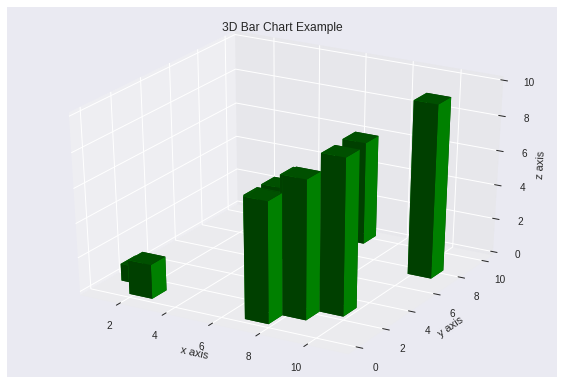
# 3D Bar Plots
import matplotlib.pyplot as plt
import numpy as np
fig = plt.figure()
ax = fig.add_subplot(111, projection = '3d')
x = [1, 2, 3, 4, 5, 6, 7, 8, 9, 10]
y = np.random.randint(10, size=10)
z = np.zeros(10)
dx = np.ones(10)
dy = np.ones(10)
dz = [1, 2, 3, 4, 5, 6, 7, 8, 9, 10]
ax.bar3d(x, y, z, dx, dy, dz, color='g')
# 3 labels because of 3d
ax.set_xlabel('x axis')
ax.set_ylabel('y axis')
ax.set_zlabel('z axis')
plt.title("3D Bar Chart Example")
plt.tight_layout()
plt.show()
import matplotlib.pyplot as plt
import numpy as np
fig = plt.figure()
ax = fig.add_subplot(111, projection = '3d')
x = [1, 2, 3, 4, 5, 6, 7, 8, 9, 10]
y = np.random.randint(10, size=10)
z = np.zeros(10)
dx = np.ones(10)
dy = np.ones(10)
dz = [1, 2, 3, 4, 5, 6, 7, 8, 9, 10]
ax.bar3d(x, y, z, dx, dy, dz, color='g')
ax.set_xlabel('x axis')
ax.set_ylabel('y axis')
ax.set_zlabel('z axis')
plt.title("3D Bar Chart Example")
plt.tight_layout()
plt.show()
# img 9860f25a-2c5a-4442-a78c-32b4335b7d0a
# @
# 3D Bar Plots
import matplotlib.pyplot as plt
import numpy as np
fig = plt.figure()
ax = fig.add_subplot(111, projection = '3d')
x = [1, 2, 3, 4, 5, 6, 7, 8, 9, 10]
y = np.random.randint(10, size=10)
z = np.zeros(10)
dx = np.ones(10)
dy = np.ones(10)
dz = [1, 2, 3, 4, 5, 6, 7, 8, 9, 10]
ax.bar3d(x, y, z, dx, dy, dz, color='g')
# 3 labels because of 3d
ax.set_xlabel('x axis')
ax.set_ylabel('y axis')
ax.set_zlabel('z axis')
plt.title("3D Bar Chart Example")
plt.tight_layout()
plt.show()
import matplotlib.pyplot as plt
import numpy as np
fig = plt.figure()
ax = fig.add_subplot(111, projection = '3d')
x = [1, 2, 3, 4, 5, 6, 7, 8, 9, 10]
y = np.random.randint(10, size=10)
z = np.zeros(10)
dx = np.ones(10)
dy = np.ones(10)
dz = [1, 2, 3, 4, 5, 6, 7, 8, 9, 10]
ax.bar3d(x, y, z, dx, dy, dz, color='g')
ax.set_xlabel('x axis')
ax.set_ylabel('y axis')
ax.set_zlabel('z axis')
plt.title("3D Bar Chart Example")
plt.tight_layout()
plt.show()
# img 9860f25a-2c5a-4442-a78c-32b4335b7d0a
 # @
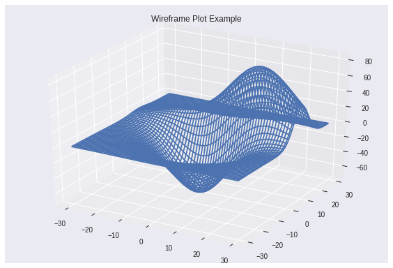
# Wireframe Plots
import matplotlib.pyplot as plt
fig = plt.figure()
ax = fig.add_subplot(111, projection = '3d')
x, y, z = axes3d.get_test_data()
ax.plot_wireframe(x, y, z, rstride = 2, cstride = 2)
plt.title("Wireframe Plot Example")
plt.tight_layout()
plt.show()
# img 5db17a2c-696e-4f7a-9c75-6ce571987ed6
# @
# Wireframe Plots
import matplotlib.pyplot as plt
fig = plt.figure()
ax = fig.add_subplot(111, projection = '3d')
x, y, z = axes3d.get_test_data()
ax.plot_wireframe(x, y, z, rstride = 2, cstride = 2)
plt.title("Wireframe Plot Example")
plt.tight_layout()
plt.show()
# img 5db17a2c-696e-4f7a-9c75-6ce571987ed6
 # @
# Seaborn
# There are several libraries like seaborn which run on top of Matplotlib that you can use in colaboratory
import matplotlib.pyplot as plt
import numpy as np
import seaborn as sns
# Generate some random data
num_points = 20
# x will be 5, 6, 7... but also twiddled randomly
x = 5 + np.arange(num_points) + np.random.randn(num_points)
# y will be 10, 11, 12... but twiddled even more randomly
y = 10 + np.arange(num_points) + 5 * np.random.randn(num_points)
sns.regplot(x, y)
plt.show()
# img 733174fa-9c1f-4107-8e74-7115f18fb088
# @
# Seaborn
# There are several libraries like seaborn which run on top of Matplotlib that you can use in colaboratory
import matplotlib.pyplot as plt
import numpy as np
import seaborn as sns
# Generate some random data
num_points = 20
# x will be 5, 6, 7... but also twiddled randomly
x = 5 + np.arange(num_points) + np.random.randn(num_points)
# y will be 10, 11, 12... but twiddled even more randomly
y = 10 + np.arange(num_points) + 5 * np.random.randn(num_points)
sns.regplot(x, y)
plt.show()
# img 733174fa-9c1f-4107-8e74-7115f18fb088
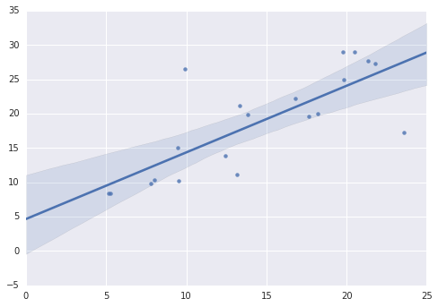 # @
# That's a simple scatterplot with a nice regression line fit to it,
# all with just one call to Seaborn's regplot.
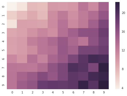
# Here's a Seaborn heatmap representing correlation
import matplotlib.pyplot as plt
import numpy as np
# Make a 10 x 10 heatmap of some random data
side_length = 10
# Start with a 10 x 10 matrix with values randomized around 5
data = 5 + np.random.randn(side_length, side_length)
# The next two lines make the values larger as we get closer to (9, 9)
data += np.arange(side_length)
data += np.reshape(np.arange(side_length), (side_length, 1))
# Generate the heatmap
sns.heatmap(data)
plt.show()
# img 52855ec8-7e81-4dff-bb96-224f43b4946c
# @
# That's a simple scatterplot with a nice regression line fit to it,
# all with just one call to Seaborn's regplot.
# Here's a Seaborn heatmap representing correlation
import matplotlib.pyplot as plt
import numpy as np
# Make a 10 x 10 heatmap of some random data
side_length = 10
# Start with a 10 x 10 matrix with values randomized around 5
data = 5 + np.random.randn(side_length, side_length)
# The next two lines make the values larger as we get closer to (9, 9)
data += np.arange(side_length)
data += np.reshape(np.arange(side_length), (side_length, 1))
# Generate the heatmap
sns.heatmap(data)
plt.show()
# img 52855ec8-7e81-4dff-bb96-224f43b4946c
 # @
# Altair
# Installation
# !pip install altair jupyter pandas vega
# !pip install --upgrade notebook
# !python -Wignore -m notebook.nbextensions install --sys-prefix --py vega
# Cell configuration
# This method pre-populates the outputframe with the configuration that Altair expects
# and must be executed for every cell which is displaying an Altair graph.
def configure_altair_browser_state():
import IPython
display(IPython.core.display.HTML('''
<script src="/static/components/requirejs/require.js"></script>
<script>
// Altair requires window.outputs to be defined.
window.outputs = [];
requirejs.config({
paths: {
base: '/static/base',
jquery: '//ajax.googleapis.com/ajax/libs/jquery/2.0.0/jquery.min',
},
});
</script>
'''))
[ ]
import altair as alt
cars = alt.load_dataset('cars')
configure_altair_browser_state()
alt.Chart(cars).mark_point().encode(
x='Horsepower',
y='Miles_per_Gallon',
color='Origin',
)
# img d66cac11-c0bd-4db0-abb3-f631d9be75e6
# @
# Altair
# Installation
# !pip install altair jupyter pandas vega
# !pip install --upgrade notebook
# !python -Wignore -m notebook.nbextensions install --sys-prefix --py vega
# Cell configuration
# This method pre-populates the outputframe with the configuration that Altair expects
# and must be executed for every cell which is displaying an Altair graph.
def configure_altair_browser_state():
import IPython
display(IPython.core.display.HTML('''
<script src="/static/components/requirejs/require.js"></script>
<script>
// Altair requires window.outputs to be defined.
window.outputs = [];
requirejs.config({
paths: {
base: '/static/base',
jquery: '//ajax.googleapis.com/ajax/libs/jquery/2.0.0/jquery.min',
},
});
</script>
'''))
[ ]
import altair as alt
cars = alt.load_dataset('cars')
configure_altair_browser_state()
alt.Chart(cars).mark_point().encode(
x='Horsepower',
y='Miles_per_Gallon',
color='Origin',
)
# img d66cac11-c0bd-4db0-abb3-f631d9be75e6
 /><xmp>
# @
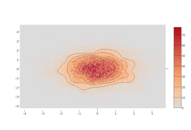
# Plotly
# Cell configuration
# This method pre-populates the outputframe with the configuration that Plotly expects
# and must be executed for every cell which is displaying a Plotly graph.
def configure_plotly_browser_state():
import IPython
display(IPython.core.display.HTML('''
<script src="/static/components/requirejs/require.js"></script>
<script>
requirejs.config({
paths: {
base: '/static/base',
plotly: 'https://cdn.plot.ly/plotly-1.5.1.min.js?noext',
},
});
</script>
'''))
# Sample
import plotly.plotly as py
import numpy as np
from plotly.offline import init_notebook_mode, iplot
from plotly.graph_objs import Contours, Histogram2dContour, Marker, Scatter
configure_plotly_browser_state()
init_notebook_mode(connected=False)
x = np.random.randn(2000)
y = np.random.randn(2000)
iplot([Histogram2dContour(x=x, y=y, contours=Contours(coloring='heatmap')),
Scatter(x=x, y=y, mode='markers', marker=Marker(color='white', size=3, opacity=0.3))], show_link=False)
# img 198b5098-5271-41a8-9761-774ff6809955
/><xmp>
# @
# Plotly
# Cell configuration
# This method pre-populates the outputframe with the configuration that Plotly expects
# and must be executed for every cell which is displaying a Plotly graph.
def configure_plotly_browser_state():
import IPython
display(IPython.core.display.HTML('''
<script src="/static/components/requirejs/require.js"></script>
<script>
requirejs.config({
paths: {
base: '/static/base',
plotly: 'https://cdn.plot.ly/plotly-1.5.1.min.js?noext',
},
});
</script>
'''))
# Sample
import plotly.plotly as py
import numpy as np
from plotly.offline import init_notebook_mode, iplot
from plotly.graph_objs import Contours, Histogram2dContour, Marker, Scatter
configure_plotly_browser_state()
init_notebook_mode(connected=False)
x = np.random.randn(2000)
y = np.random.randn(2000)
iplot([Histogram2dContour(x=x, y=y, contours=Contours(coloring='heatmap')),
Scatter(x=x, y=y, mode='markers', marker=Marker(color='white', size=3, opacity=0.3))], show_link=False)
# img 198b5098-5271-41a8-9761-774ff6809955
 # @
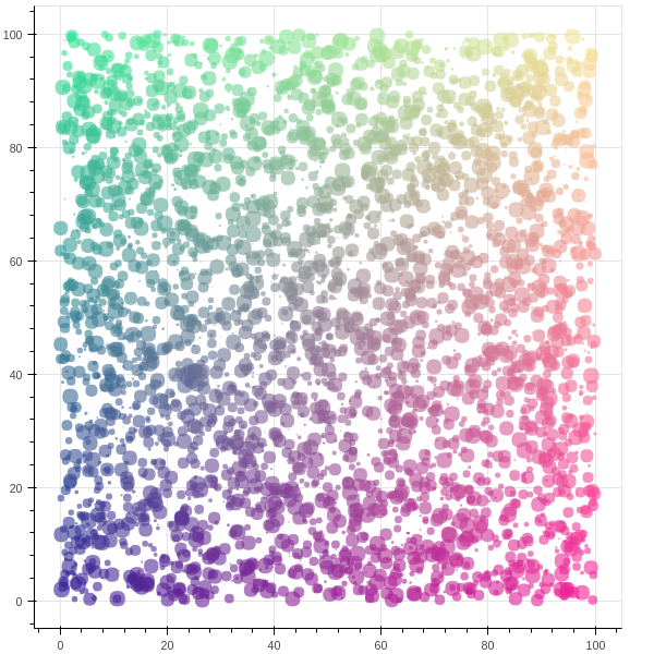
# Bokeh
# Installation
# !pip install bokeh
# Sample
import numpy as np
from bokeh.plotting import figure, show
from bokeh.io im
import numpy as np
from bokeh.plotting import figure, show
from bokeh.io import output_notebook
N = 4000
x = np.random.random(size=N) * 100
y = np.random.random(size=N) * 100
radii = np.random.random(size=N) * 1.5
colors = ["#%02x%02x%02x" % (r, g, 150) for r, g in zip(np.floor(50+2*x).astype(int), np.floor(30+2*y).astype(int))]
output_notebook()
p = figure()
p.circle(x, y, radius=radii, fill_color=colors, fill_alpha=0.6, line_color=None)
show(p)
# img efd3d90e-2adb-4ef7-9751-61ae873d18a5
# @
# Bokeh
# Installation
# !pip install bokeh
# Sample
import numpy as np
from bokeh.plotting import figure, show
from bokeh.io im
import numpy as np
from bokeh.plotting import figure, show
from bokeh.io import output_notebook
N = 4000
x = np.random.random(size=N) * 100
y = np.random.random(size=N) * 100
radii = np.random.random(size=N) * 1.5
colors = ["#%02x%02x%02x" % (r, g, 150) for r, g in zip(np.floor(50+2*x).astype(int), np.floor(30+2*y).astype(int))]
output_notebook()
p = figure()
p.circle(x, y, radius=radii, fill_color=colors, fill_alpha=0.6, line_color=None)
show(p)
# img efd3d90e-2adb-4ef7-9751-61ae873d18a5